Simple is good. That’s why I’ve always admired Project Unloaded, a gun violence prevention non-profit with a singular point of view.
Gun violence in the U.S. is a knotty issue with a million things to consider — the Second Amendment! red flag laws! systemic racism! and so on. It can feel overwhelming and impossible to solve.
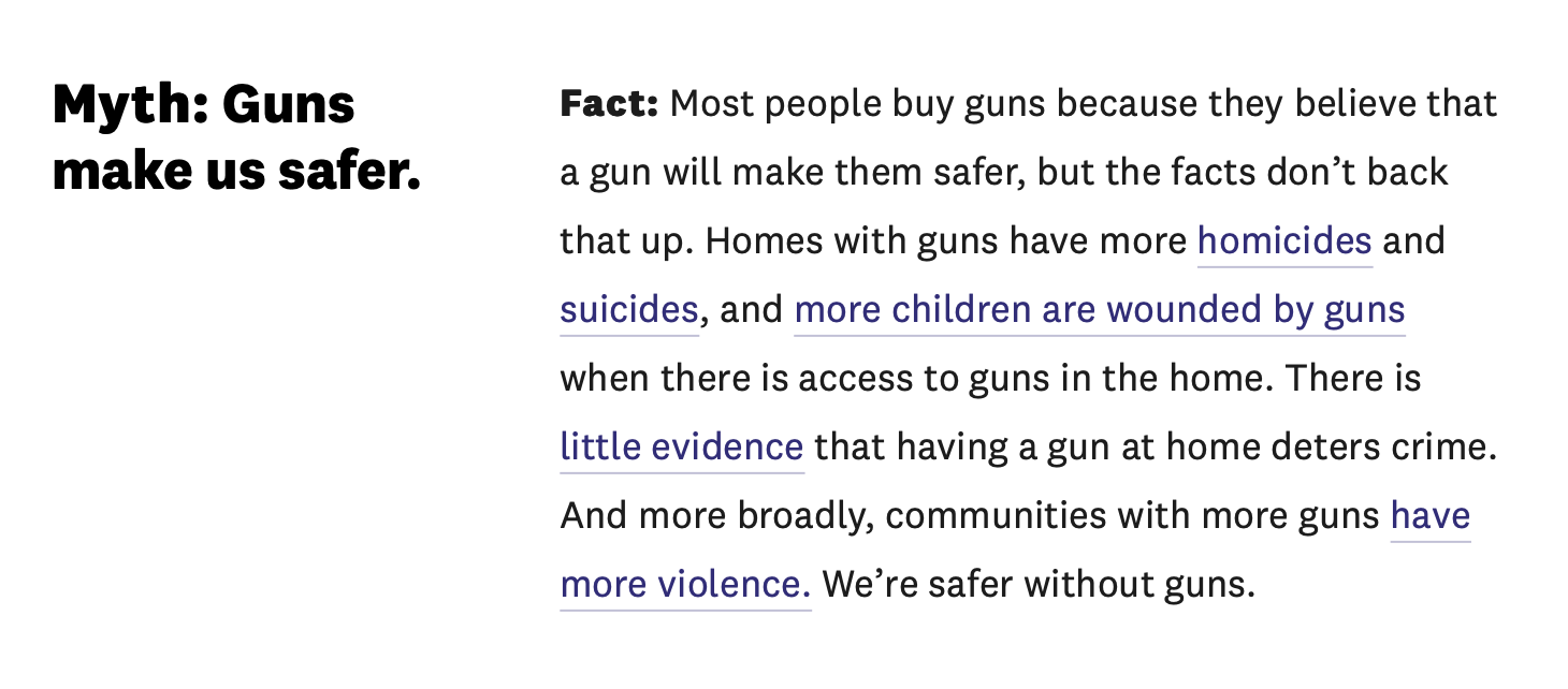
Project Unloaded focuses on just one thing: If fewer people choose to own a gun, there will be fewer gun deaths. Their work centers on helping young people make informed choices about gun ownership (and the risks involved).
I'm Andrew McGill, a product builder who turns delightful ideas into real things.
I used to make stuff at The Atlantic and POLITICO. Now I build things with people like you.
Sounds simple, right? But there’s a lot of data behind what they do, which can make it a bit overwhelming to explain.
This summer, I worked with Project Unloaded to craft an interactive experience walking people through the facts about gun ownership, with the goal of turning a dense “Facts and Research” page into something far more approachable. Here’s how we did it.
Conversation, not recitation
Project Unloaded had already done the heavy lifting in pulling the research together. And their “Facts” page had a good “mythbusters” structure.
But, there were two problems:
- It was long. For some audiences, this is fine. A journalist or a researcher will take the time to scroll and pick out the information they need. But Project Unloaded wanted to reach everyday readers, particularly teens. For them, brevity is a virtue.
- It didn’t have a narrative flow. When you’re trying to teach something (or persuade someone!), it’s so helpful to tell a story rather than recite points. People like to be led from Point A to B to C. Mythbusting was a cool conceit, but it had no larger structure.
So we reframed the page as a conversation. Our rules: it had to read like a pair of real people talking, and each question had to follow naturally from the last.
Now, the page had a conversational flow – and each item ended up being a good bit tighter.
Just Enough Data™️
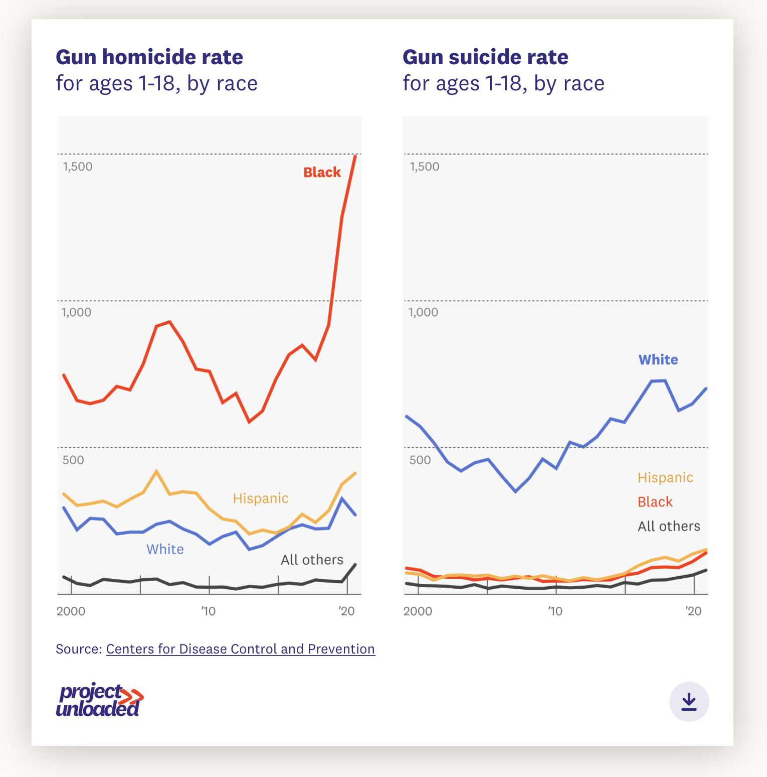
If a picture is worth a thousand words, a data visualization has got to equal a few dozen number-laden paragraphs. And when much of the research around gun violence is heavily statistical in nature, having excellent charts was a must in making the point clear.
Three tactics here:
-
I built out a “scrollytelling” introduction, which stepped readers through how the U.S. is a statistical outlier in both gun ownership and gun violence.
-
Whenever possible, we paired stat-heavy sections with a simple data viz — meaning that more often than not, we could cut confusing copy and get to the point faster.
-
Every so often, we’d drop in a “chunky number” card, which drew attention to some of the starkest stats.
The key is to avoid stuffing in too many visualizations — then you just get visual soup. But in the proper context, a chart makes a huge difference.
Simple simple simple
Following in the above point — we kept the design clean!
I’ll confess, I love this stuff and always want to cram in a million design “grace notes.” But after the 10th animation has triggered and the fourth typeface has reared its head, your message starts to take a back seat to the designer’s ego.
So we kept the visual style spare, using Project Unloaded’s site-wide components whenever possible and keeping flourishes to a minimum. That meant when we DID break style — those tilt-y section breaks, for instance — our choice stood out.
Tech corner
- Project Unloaded was migrating to Wordpress and used Elementor for the rest of the site. I scaffolded the page in Elementor to keep the text as edit-friendly as possible, and tossed in a fair amount of custom JavaScript to make the scrollytelling and my other interactions work.
- The charts are in D3, which somehow is on version 7 now 😅
- No React or Webpack for this one; If it was just a litttttle but more complicated I probably would have gone the preprocessing route.
In conclusion
Hooray for clear and beautiful communication! I loved jumping into this data-rich challenge — and one with huge implications for America. If this strikes a chord with you, reach out! I’d love to talk.
Other case studies


I’d love to chat. Drop me a line.