Remember the woman who sued McDonald's in the ‘90s after spilling hot coffee on herself? She became a punchline on late-night shows, an example of just how lawsuit-happy America has become.
But that’s not the full picture — and it’s exactly the kind of story Retro Report loves to unravel. They're a non-profit newsroom that produces short documentaries exploring how past events shape the present, often in collaboration with outlets like PBS and The New York Times.
I discovered them 10 years ago while they were investigating what actually happened with that McDonald's lawsuit. Turns out, the situation was far more nuanced than most people thought—McDonald's had a history of heating their coffee to scalding levels and had settled out of court dozens of times.
I'm Andrew McGill, a product builder who turns delightful ideas into real things.
I used to make stuff at The Atlantic and POLITICO. Now I build things with people like you.
Nearly 300 documentaries later, Retro Report saw an opportunity to refine their mission—and they reached out to me for help.
The problem
During the pandemic, teachers were desperate for educational materials suitable for remote learning.
As it turns out, Retro Report was a great match. Their documentaries are often 10 minutes or shorter, perfect for a class session. Unlike the more traditional, Ken Burns-esque material, Retro Report's films had a journalistic flair that engaged students.
Acknowledging this, Retro Report began to shift strategy. They hired a head of education and started creating lesson plans to accompany their films.
But the website wasn't equipped to handle this educational pivot. Retro Report was maintaining two separate sites—one editorial, one educational—and duplicating videos on both.
This needed to change.
How I approached solving it
A few steps shored up my strategy quickly:
- First, I ran an audit. I reviewed retroreport.org’s sitemap and found a lot of duplicated content. Accessing the raw database files gave me insight into how I could integrate the two types of content.
- Next, we talked to teachers. With the help of Retro Report's audience team, I created a survey to gauge how educators navigate the site and identify their pain points. Over 100 teachers responded.
- Finally, prototype prototype prototype. I jumped into Figma and began sketching out a combined video page, which highlighted each documentary’s journalistic intent but made it super easy for teachers to navigate the educational material.
I spent most of my time designing and developing three pages:
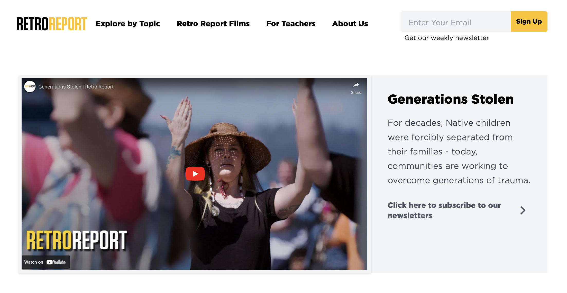
The homepage
It now starts with a strong brand statement, followed by a sample of Retro Report’s journalism and endorsements from both the journalistic and educational communities.
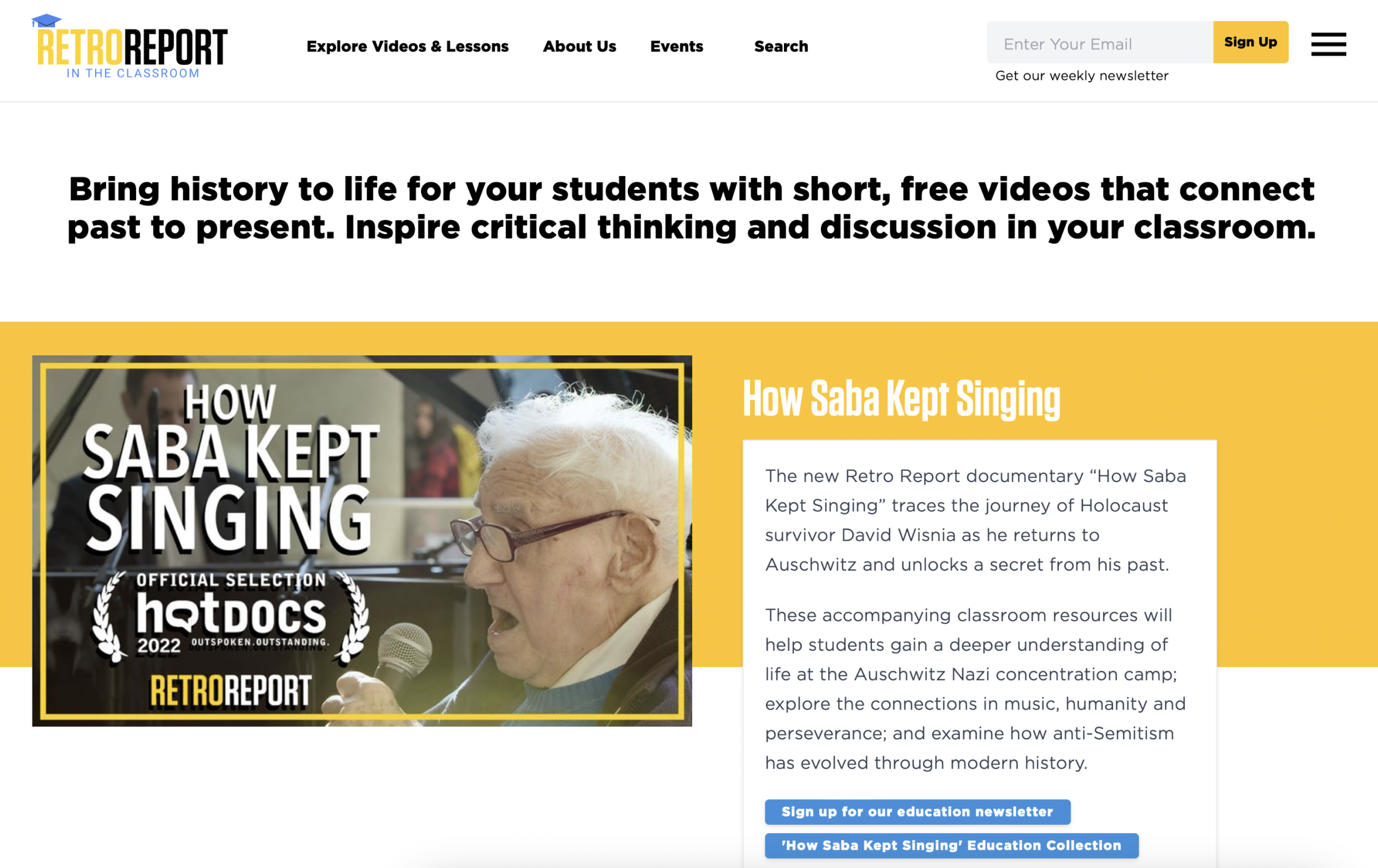
The video page
No more division between “editorial” and “educational” videos; there's now a single video page, enriched by educational resources below.
The video library page
I emphasized the taxonomy and provided multiple ways for users to filter and search through Retro Report's extensive catalog.
Technical corner
This was a WordPress build. Since I couldn't access the site’s core styles (Retro Report uses Newspack, a subsidiary of Automattic for newsrooms), I created a plugin containing custom templates.
I used Timber and Twig to build these templates, integrating some Sass preprocessing through Gulp.
The result
Retro Report no longer has a split personality. It’s a documentary film studio with a journalistic sensibility, serving teachers, students and the general public. Now their website reflects that dual mission — without walling each half off from the other.
Other case studies

I’d love to chat. Drop me a line.